Multi-Axes Made Easy
Today we want to introduce the last of the new features we are implementing into the 2.9 release which we have recently finalized.
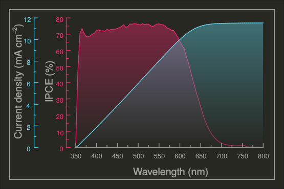
To demo this new feature, let’s use an example contributed by one of our users. This example is based upon the measurement data from a solar cell. The so-called “incident photon-to-current conversion efficiency” (IPCE) tells us how many incoming photons are converted into free electrons in the cell. This conversion efficiency, together with the generated current and their dependency on the wavelength of the incoming light, are the usual subjects of studies and optimizations for solar cells.
Consider the example where we want to plot the IPCE and the current density in the same plot and to see their behavior as a function of the wavelength. Your first idea may be to just lay out the curves for the plot like this:
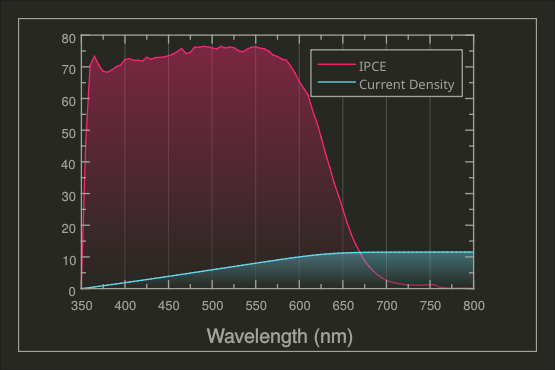
But this reveals two problems:
- The two quantities have different ranges (IPCE goes from 0% to ca. 80%, while the current density goes from 0 mA/cm^2 to ca. 12 mA/cm^2). This problem can become even more severe if the data ranges differ by many orders of magnitude.
- The two quantities don’t share the same units. That makes it impossible to put a meaningful description on the y-axis.
We can remedy the situation a bit by using a plot legend which helps discriminate the different curves. Unfortunately the result is still far from being optimal, and this way of plotting different quantities having different units is commonly considered wrong.
A better solution for this kind of visualization is to work with two different data regions and axes. This is something that was not possible in LabPlot before now and it is a feature for which we had multiple requests in the past. This has led us to recently implement this missing functionality, and the plot below shows what it looks like:
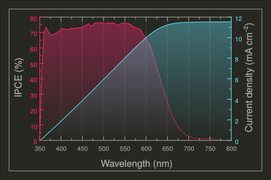
Note how, by working with two different axis scales and colors, you can produce a much clearer and more coherent visualization. Such a result is easily achieved in LabPlot now, and it all starts with the definition of the two data ranges for the x and y directions:
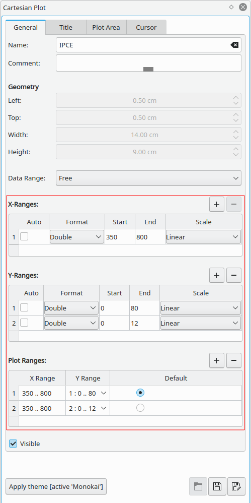
The red-highlighted area in the image above is the new feature. The ranges for x and for y are combined into “Plot Ranges” and the objects on the plot like axes and curves are “assigned” to the different plot ranges. Once the definition of the plot ranges is done, the desired visualization for the two curves in the plot above is achieved with one single step by selecting the proper data range for every curve:
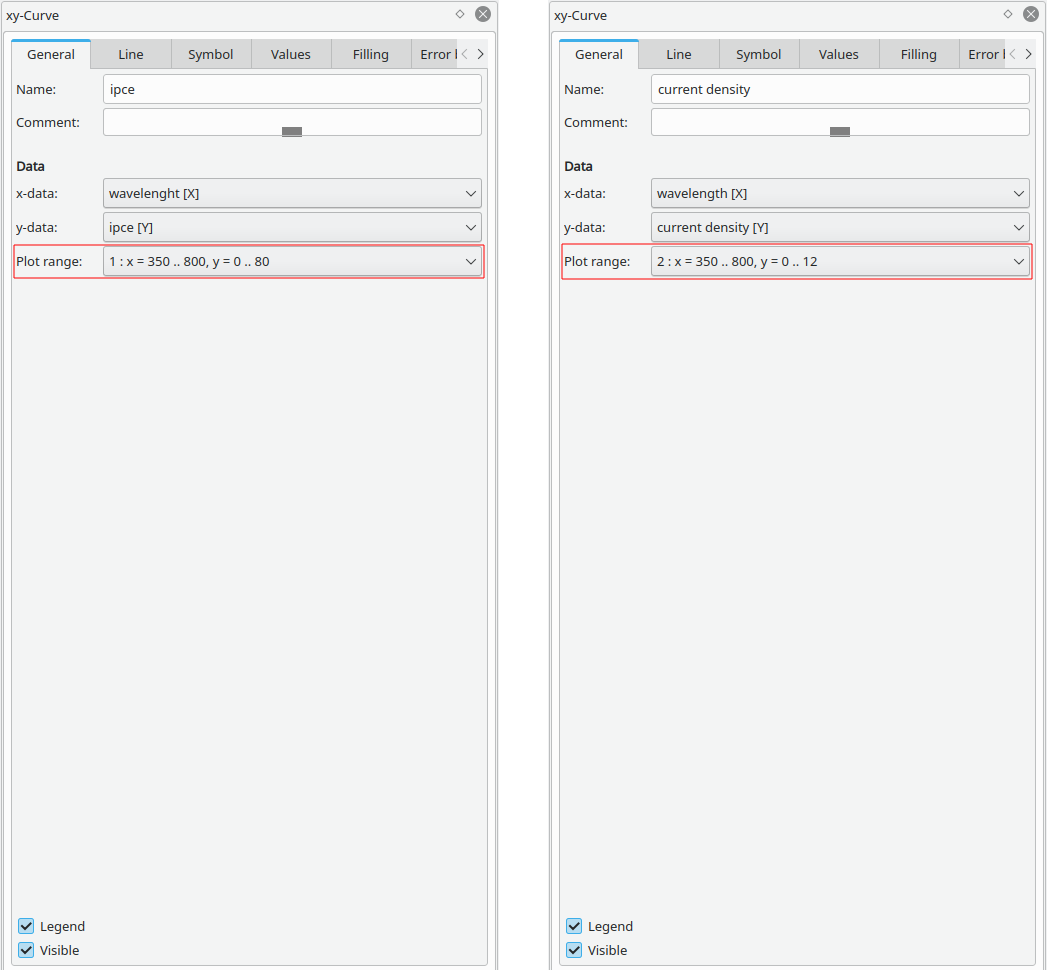
We arrive at the final result by assigning the second y-axis to the second data range and by adjusting the color properties of the second axis.
The user has a lot of flexibility in LabPlot to position the axes. Another possible visualization utilizing the two-axes technique is shown below:
A detailed walk-through for this example is maybe an idea for a future tutorial.
Suffice to say that, as mentioned, the development of new features for 2.9 is finalized, and we are now concentrating on the stabilization and quality control work to prepare everything for the release. People interested in contributing to these activities are invited to test our nightly builds and to provide us with feedback.
Stay tuned for more news regarding version 2.9!

The numbers on both y-axises are the same for me. How do i change that? I can however import a benutzerdefinierte spalte with the numbers I want but this does not scale automatically when i change something on the y-range
(I can’t see my message here during typing because the font is set to white and the background is also white, i have to srg+A to get the blue outline of the written text)
After you’ve defined the different ranges you need to assign the objects like axes and curves to them. The number on both y axes are same in your case because either the y-range are the same or because you assigned both axes to the same range. We’re finalizing the next release 2.10 right now and are going to release a demo video soon walking through the process of creation of such a visualization with two ranges. I hope this will help to get into this topic more easier.
P.S. thanks to the point with the white font color! We’ll fix it.
Hi Labplot-Team,
I guess I just don’t get it. I followed the instructions above and am able to reate a wonderful graph with 4 different y-ranges.
Now I want to have 4 y-Axes with titles on the left, but the space left to the diagram isn’t sufficient and I’m not able to adjustg this space. How do I do that?
Thanks a lot for this piece of Software!
Samuel
Ups – sorry,
I found it. It’s the padding.